We’ve already talked about logos, branding, and color systems (be sure to check out those posts if you haven’t yet). In this post, we’re going to talk about 3 different color palettes and provide you with some tips on picking one for your brand.
Back to basics
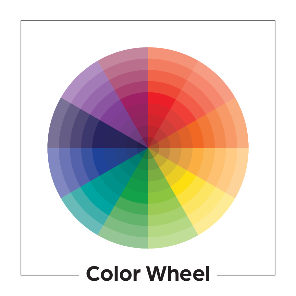
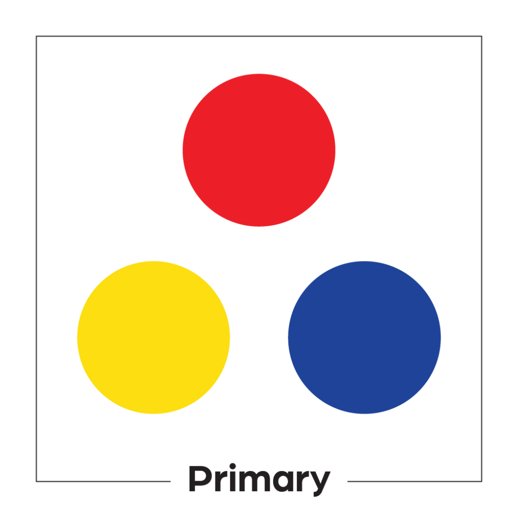
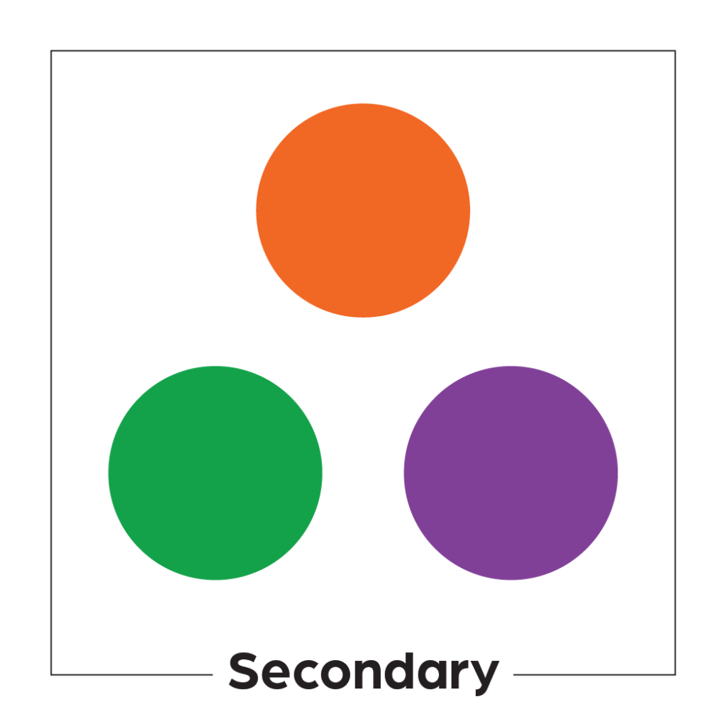
For starters, it’s important to know the basics of the color wheel. You might remember this from an elementary school art class. The color wheel is a circular graph showing all the colors of the rainbow (see below). Those colors typically include: red, orange, yellow, green, blue, and purple. Red, yellow, and blue are all considered primary colors. They cannot be created by mixing colors together. Orange, green, and purple are known as secondary colors because they are created by combining two primary colors. On the wheel, these colors are alternating, so every other color is either primary or secondary.
Analogous color palettes
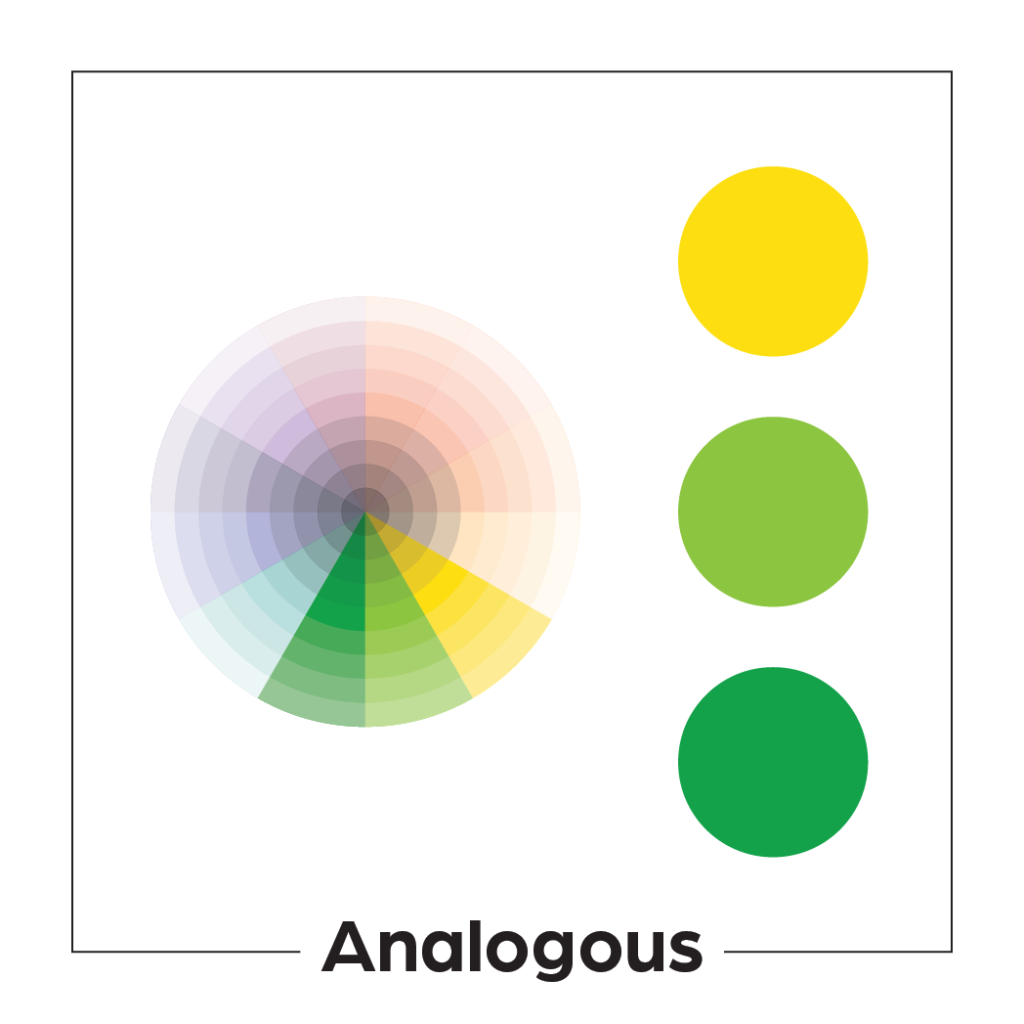
Analogous color palettes are created by using three colors that sit next to each other on the color wheel. One color usually dominates the palette while the other two support it. Analogous color schemes typically look a little more monochromatic (like they have one color) than other options. There can be higher or lower contrast depending on how similar the three colors are.
Complementary color palettes
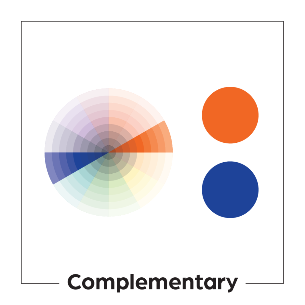
Complementary color palettes are sometimes referred to as contrasting color palettes. They are created by picking two colors that sit opposite each other on the color wheel. Complementary color schemes are often high contrast. There is usually a clear distinction between the two colors, unlike what you might see with analogous.
Monochromatic color palettes
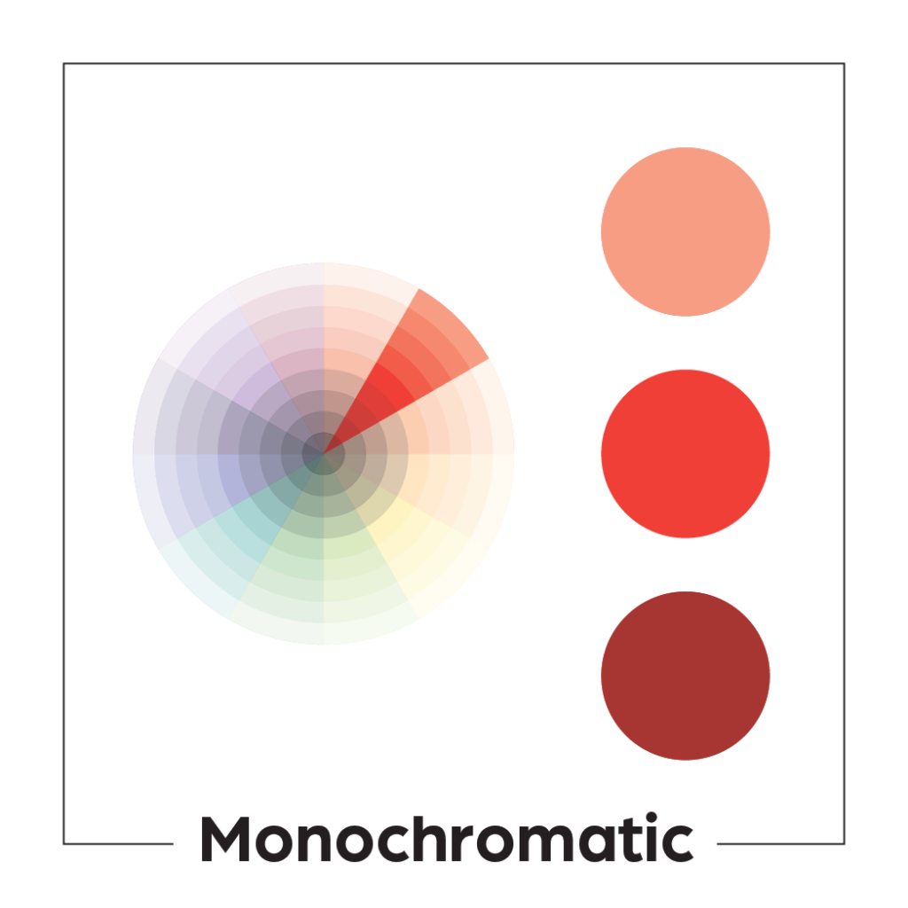
Though similar to analogous, monochromatic color palettes are a little different. An analogous color palette is created by three different colors, while a monochromatic one is created by different tints and shades of the same color. (Tint refers to a lighter version of the color and shade refers to the darker version.) Monochromatic color palettes, like analogous, can be either high or low in contrast.
Adobe has a really cool color palette generator that can help you get started. It explores even more types of color palettes.
How many colors should be in a brand palette?
You may have noticed that each of the palettes discussed are comprised of only 2-3 colors. These color palettes can be extended. Logos play a role in determining what colors you choose, and a good rule of thumb is to have 2-3 colors in your logo. Those colors from your logo will be the first colors in your brand palette. Most brands will add 1-2 more colors at this stage, giving a total of 4-5 colors for the brand. You want to create consistency between your logo and other brand assets (be they printed or digital). Having too many colors can make that consistency difficult to achieve.
You can have a secondary color palette in your brand if you decide that you want to utilize more color. Some brands even extend as far as a tertiary (or third) color palette. If you are going to go this route, you still want to maintain consistency. If you choose an analogous palette, pick secondary colors that are similar. Don’t choose a bunch of high contrast, complementary colors—they won’t harmonize well with your original palette. The same is true if your primary palette is complementary or monochromatic.
As with all things branding, consistency is key.
For more help with creating a brand for your business, contact Bold River Marketing. We offer graphic design and web design solutions, and we can help to create a brand that best represents your products or services.

