

When marketing your business, you want to have an eye-catching advertisement so that people remember you long after they’ve left. This can often be achieved with innovative designs, bold claims, appealing deals, and intriguing products. Other times, advertisements capture peoples’ attention for different, less positive reasons. Below are 10 design fails for you to learn from, laugh at, and hopefully avoid.
1. An Unfortunate Series of Advertisements
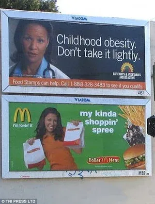
When advertising with a billboard, you should generally try to look for places with a lot of traffic, like highways or main roads. This will allow your ad to get exposed to more potential customers than if it were somewhere more secluded. It may also be a good idea to see what other advertisements are already there. If you don’t check, you might end up in a situation like this. One advertisement warns about childhood obesity while the other markets food with a less-than-healthy reputation just below.
The irony here is quite funny. And, while it likely wasn’t the point either advertiser was trying to make, the contrast hopefully helped them both in the long run.
2. Hope Isn’t the Only Thing Ahead
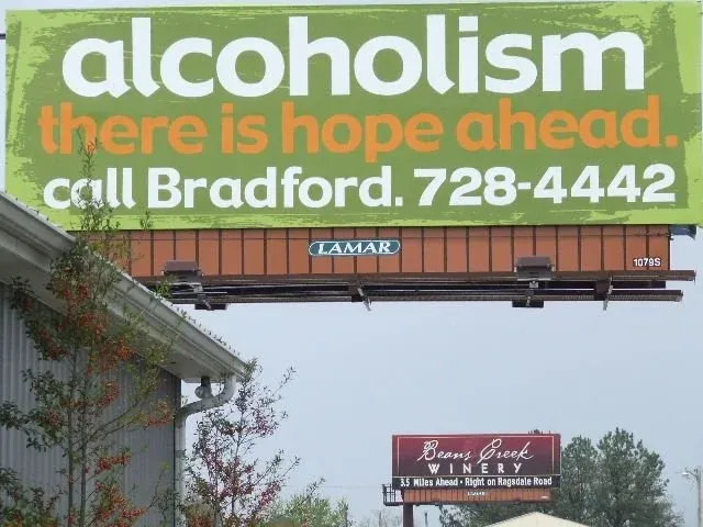
Just like the first example, this billboard is plagued by an inconveniently placed neighbor. It may or may not be intentional on the part of the winery, but it does add a sort of tongue-in-cheek vibe that Bradford Health Services likely wasn’t going for. While it’s uncertain how the advertisements worked out, we’re sure it caught people’s attention.
3. Don’t Read This
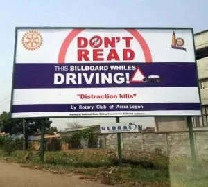
Reading billboards while driving can pose a hazard to drivers by taking their attention off the road. Most billboard designers will tell you to keep the text big and brief because drivers can only look for a few seconds at most.
While the club who put together this billboard likely had good intentions, their message is lost in a design that could create the very problem they’re trying to prevent. Their first mistake? Writing “don’t read” in large, red letters. It’s like telling someone, “Don’t push this red button.” They’re going to want to push it all the more. Their second mistake lies in the rest of the design. By making the rest of the text smaller and dividing it up in a strange way, it actually makes the billboard harder to read. They wanted to decrease the number of distracted drivers, but they likely achieved the opposite of their goal.
4. Text This Number!
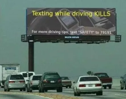
Here’s a second example of a failed distracted drivers ad campaign. While the messaging on this one is clearer and easier to decipher, there’s a blaring problem along the bottom of the billboard. It’s definitely a little…hypocritical. While it was certainly attention grabbing, if it spits in the face of the very thing it’s trying to get drivers to do (or not do), it’s not an effective campaign.
5. SASA LELE
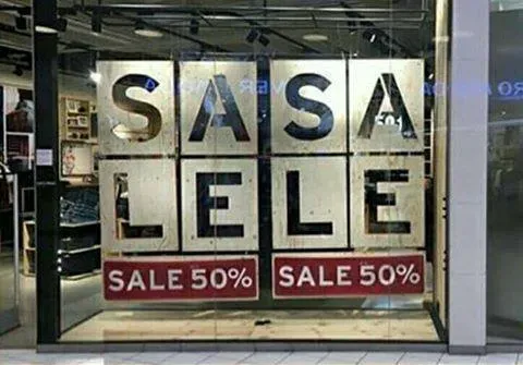
You can probably guess why this one is a fail. By itself, the poster makes sense. There’s a 50% off sale. But put two of those signs together and now you’ve got SASA LELE.
There have been very few successful designs with words that are broken up like this. Most seasoned designers would recommend sticking with traditional word placement to avoid this exact problem. It does draw the eye, but can customers really trust this store’s math given how bad their planning is?
6. To Be Successful, You Must First Die
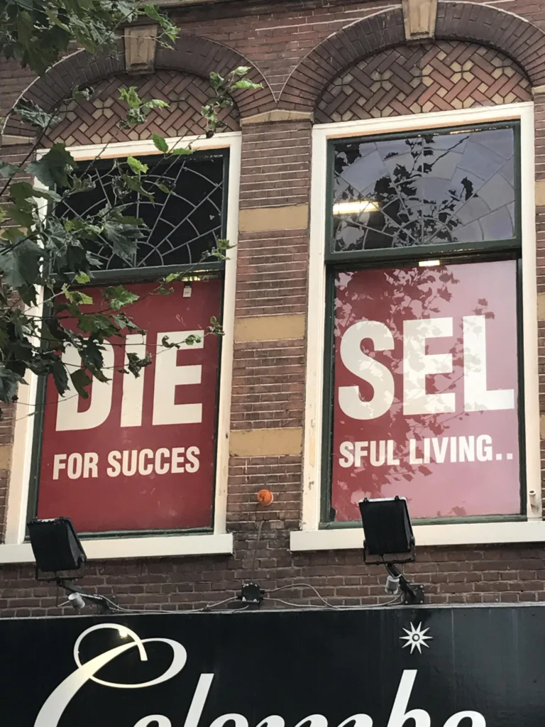
Here we have another example of why you shouldn’t break words up. This appeared in the windows of an Italian retail clothing store. While it might seem natural to simply cut a poster in half when it doesn’t fit in the window, you run the risk of saying, “Die for success,” followed by a second panel of nonsense. If they were trying to write a quote that sounded like Sun Tzu, they nailed it.
7. The Math Ain’t Mathing
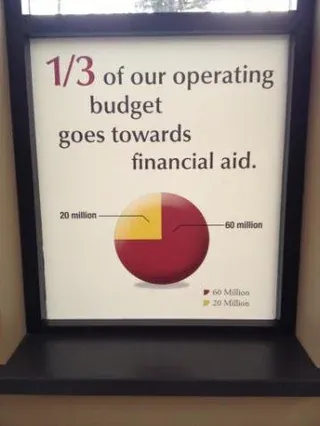
Sometimes advertisements use statistics to get their point across. When you do this, it’s important that the math adds up. Whoever designed this ad could’ve benefitted from a bit more proofreading. Given the 1/3 statistic, they appear to have then created a pie chart with incorrect values. Asking someone else to take a look at your work before heading to the printer is always a good idea.
8. Modern Era Picasso
It’s important to consider the location of your advertisement, as stated in previous examples. It’s also important to consider the object on which you are advertising.
The advertisement in this example has nothing wrong with it. The placement of the ad—on a billboard with a sharp corner—is the issue. You have to be careful with pictures of faces. Whether you’re advertising on a nontraditional billboard like this, a bus, a park bench, or any other surface that could be oddly shaped, consider the shape before putting a face on it. It’s all too easy to end up with distorted pictures like this one.
9. Maybe It’s A Sign
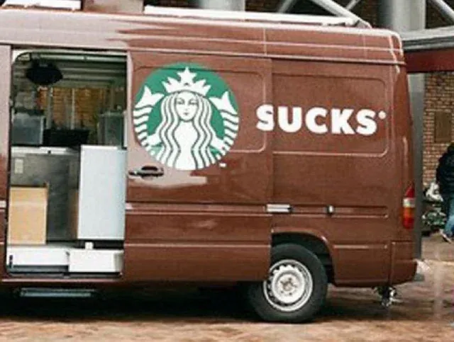
Marketing comes in different forms, and sometimes you may want to reach more people with your advertisements. One way you can do that is by putting your logo and name on a van or a truck. You can turn your regular work vehicle into a moving billboard and gain exposure everywhere you go. Consider testing out your marketing projects before you decide to put them to use. Always be wary of where the lettering is, or you may end up with an…unintended message.
10. A Darkly Proactive Funeral Home
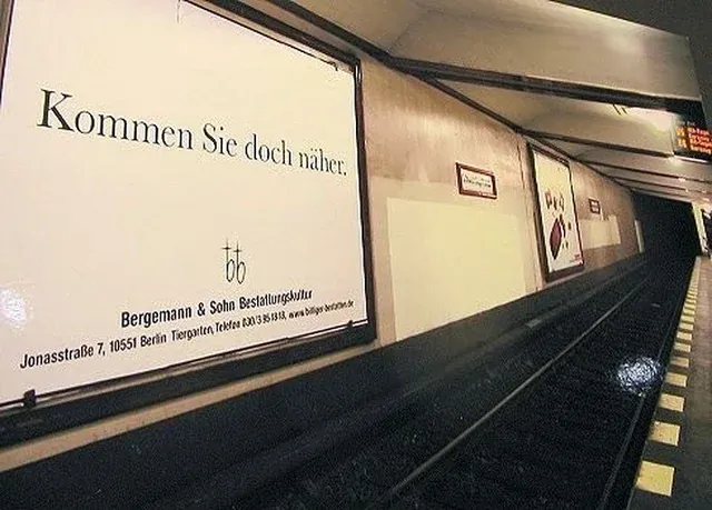
This last design failure appeared in Germany. When translated into English, it says, “Come Closer.” You probably shouldn’t listen to that sign, though, since the subway line is right in front of it.
Who would make such a sign? Well, as it turns out, it was a funeral home. They either had a dark sense of humor or a desperate need for customers. Either way, this sign could be considered both a design fail and a success with the amount of attention it received. Let’s just hope no one listened to it.
Avoid Design Failures with Help from Bold River Marketing
Design fails happen all the time, whether due to poor placement, unclear messaging, or ineffective design. If you want to avoid these major (and costly) mistakes, contact Bold River Marketing. We can help you create clear, attractive advertisements to promote your business.