
Fonts are easily one of the coolest parts of graphic design. There are so many fonts to choose from and people are making more all the time. If you’re new to typography, it can be challenging to sift through so many fonts. Here are 5 tips to help you pick fonts that will elevate your business’s brand.
Tip # 1: Limit the Number of Fonts You Use
Like we said in the intro paragraph, there are a lot of fonts to choose from. It’s easy to have multiple favorites and hard to narrow them down. Generally speaking, you want to limit the number of fonts you use for your brand. Most brands use anywhere from 2 to 5 fonts, and they almost always have specific cases for when they use them.
Generally, 2 to 3 fonts are for things like advertisements, business cards, and other printed materials. The remaining fonts cover things like your website, your email signature, or situations where people don’t have access to the main font(s) of the brand. Almost all computers have the same standard fonts (think Times New Roman and Calibri), but some fonts are licensed specifically by Apple or Windows. In those cases, it’s helpful to have some backups or alternates that are similar enough to maintain your brand.
Tip #2: Pick Fonts that Go Together
When you’re juggling multiple fonts, it’s important to pick ones that work well together. Some fonts are part of what’s known as a font family. Font families are when one font has multiple weights (or thicknesses) available. There’s usually a regular version, an italicized version, and versions that are bolder and thinner. Some font families have narrow and wide versions of the font as well. Font families are great because they pair well together.
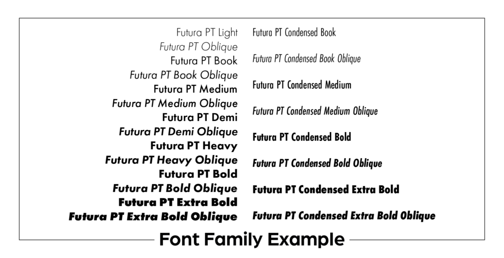
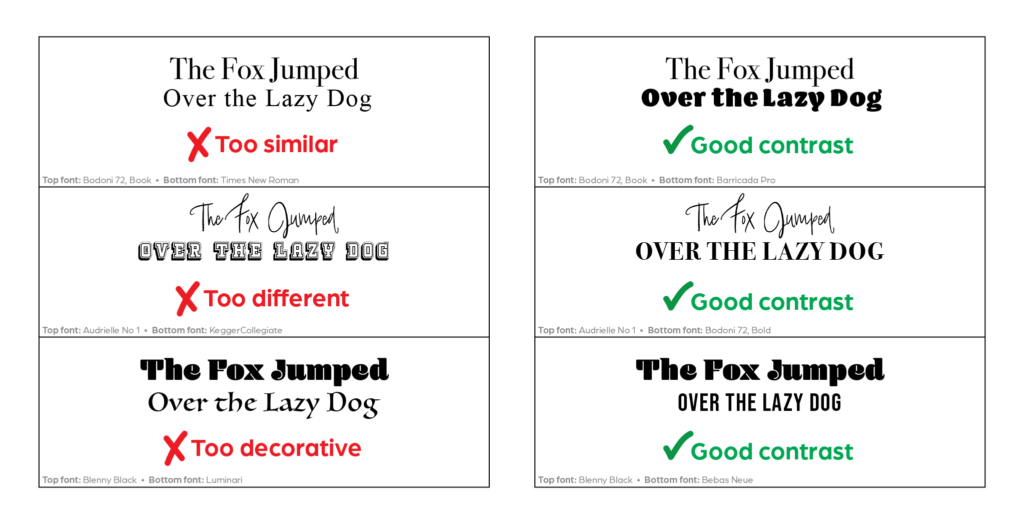
If, however, you choose to use 2 different fonts, avoid fonts that are too similar or too different. Pictured are a few examples of effective and ineffective font pairings to help you when picking your own combinations. You can also check out Adobe Fonts for more font inspiration.
Tip #3: Use Complete Fonts
With all of the fonts floating around online, there are many incomplete ones. You’ll typically find these on websites with fonts that are free to download. Those sites are often full of user-generated fonts. While you can find some really cool options, because it’s not a paid version, you’ll often get fonts that are missing characters. You want to find fonts that include numbers, symbols, punctuation, and accents. Most websites that sell fonts or offer free downloads should include a preview of the font so you can see which characters are included. And, as a side note, be careful where you download free fonts. Free is always nice, but you often get what you pay for and a good font that you can use for years is a good investment.
Tip #4: Pick Fonts that are Easy to Read
This tip is dependent upon two things: your target audience and your application of the font. If, for example, you are designing a billboard that is appealing to older adults, you want to pick clear, bold fonts. Stay away from decorative or script fonts, as most people who view your billboard will only have a few seconds to see it as they drive past. If you’re designing a catalog for your young, 30-something customers, you can probably afford a more decorative font here and there, but even then you should keep it in the headers, where the text is bigger. Fonts for things like business cards or letters with a lot of copy should be simple and easy to read even at a small size. Fonts for web use should also be easy to read, and should be sized up enough for mobile users to see on their phone screens. When in doubt, test it out.
Tip #5: Use Thematically Appropriate Fonts
The further into the design world you delve, the more you’ll hear about fonts that designers love to hate. The two biggest offenders: Papyrus and Comic Sans. Technically speaking, there’s nothing wrong with either of those fonts. There are situations where it would be appropriate to use them. Comic Sans, for example, is great for use in comics. It’s also a nice font for young children because the lowercase “a”s and “g”s are simply shaped and easy to read. The problem arises when people choose to use fonts like these in situations where it is not appropriate.
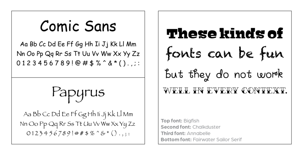
The more decorative the font is, the more specific the use has to be. And, while decorative or handwritten fonts can be fun, they may discredit your business if you use them on materials that have a more serious tone. By all means, pick fonts that you like and have fun with your designs, but remember your target audience. You can also take notes from your competitors and from businesses with brands you admire. We’re not saying you should directly copy anybody, but see what makes other brands successful and apply those principles to your brand.
Alphabet Soup
Now that you’ve perused these 5 tips for picking fonts, you should have a better idea of how to pick fonts to help your business’s brand. If you’d like more help with your brand, reach out to us at Bold River Marketing. We have a design team that’s passionate about creating and will work with you to set up a brand that meets your business’s needs.