
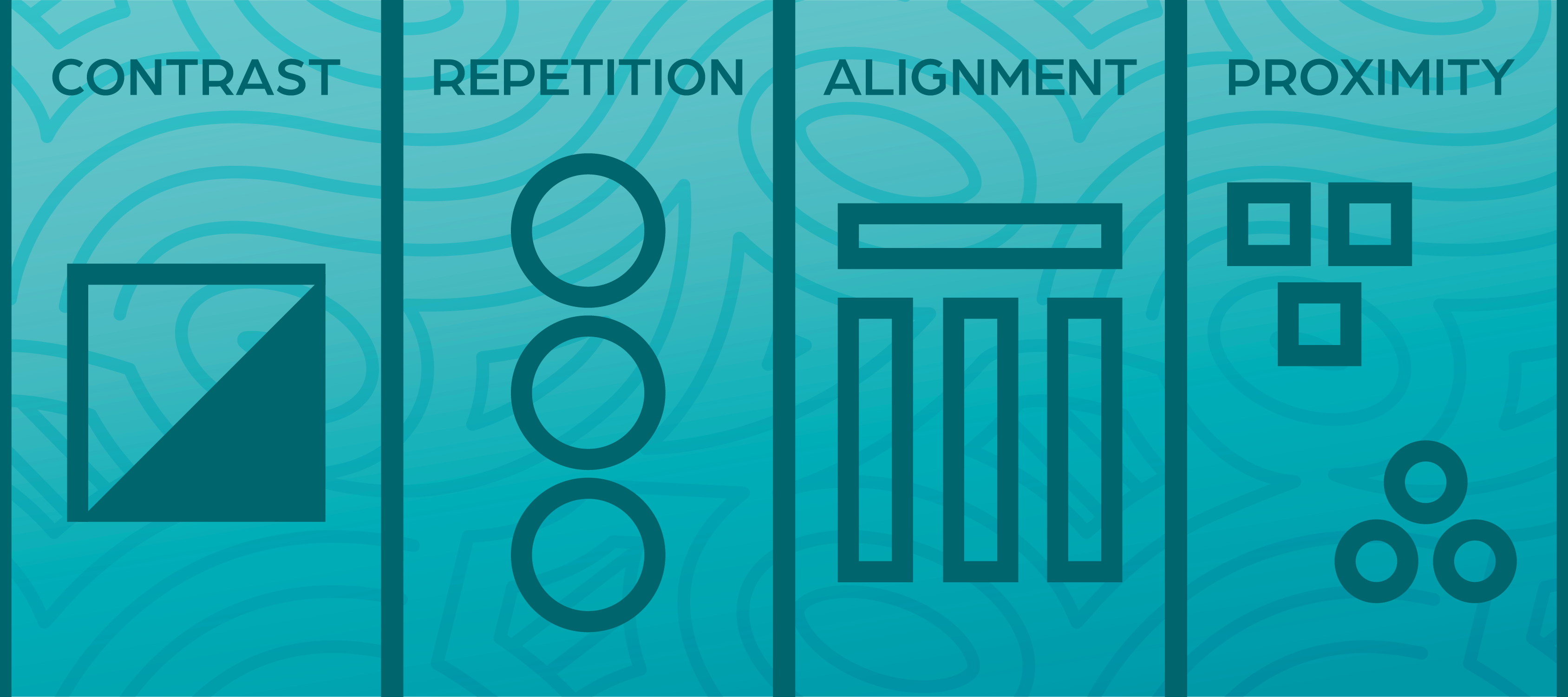
Design is, essentially, a system by which you organize information. Good design tells a story or communicates a message in a way that is both easily understood and aesthetically pleasing. It is the intersection between substance and flash. If you’re unfamiliar with design, it can be difficult to determine what makes certain designs effective and what makes other ones ineffective. In this post we will go over four of the most common principles of design and their very memorable acronym: the principles of C.R.A.P.
C = Contrast
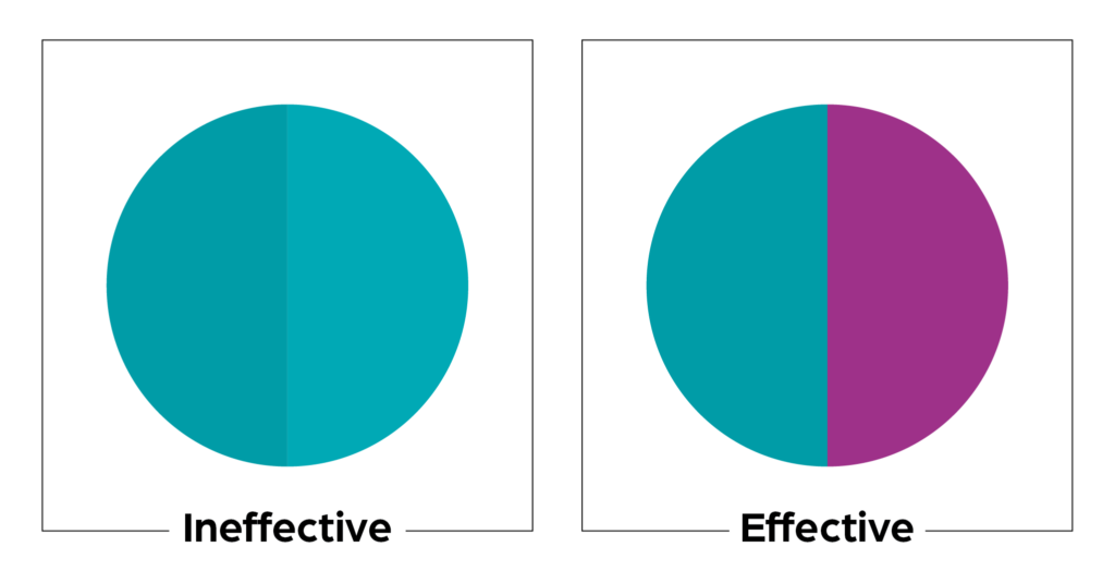
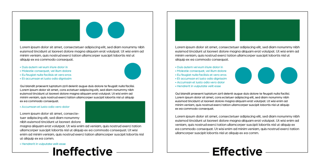
Contrast refers to difference. The most common form of contrast you’ll see is a contrast in color, but you can apply contrast to other things as well. Size, shape, texture, and line thickness (also called line weight) are all good examples of elements that can be contrasted. You can also contrast fonts (stick to two or three fonts). As with all things in design, there needs to be a balance. Use too much contrast and your design will look busy or use too little and your design will be boring. Overall, the goal of contrast is to help emphasize what’s important and de-emphasize what’s not important.
Adobe has an excellent tool on their site for creating color palettes. This could be helpful if you get stuck on how to find good color contrast.
R = Repetition
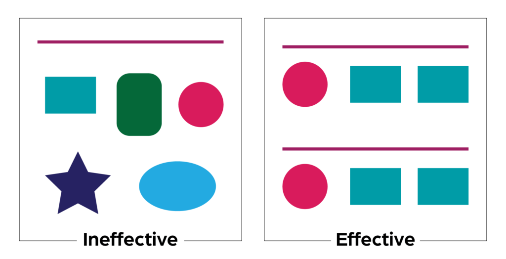
Repetition refers to using the same elements throughout your design. You should repeat things like colors, shapes, fonts, imagery styles, and text alignment. This can help to create patterns for your audience and make your design easier to follow and understand. Repetition is also good for creating visual consistency and aiding your audience in remembering your message.
A = Alignment
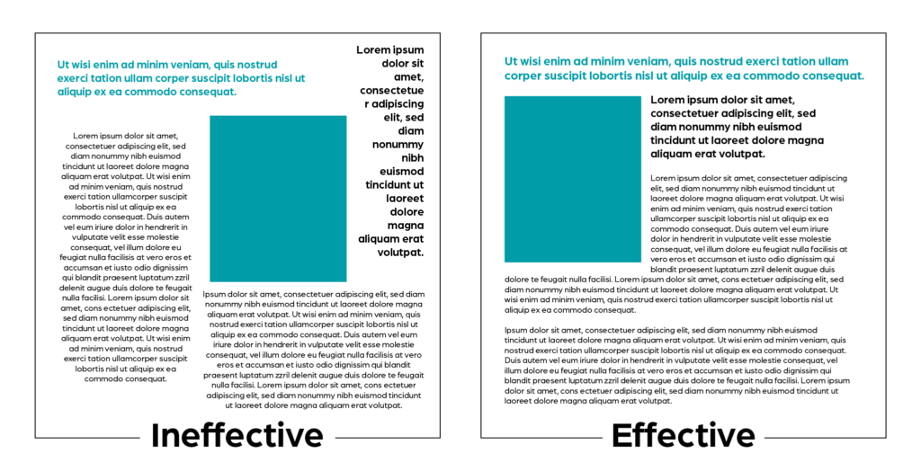
Alignment refers to how your elements line up with one another. You need to be purposeful in your alignment. You don’t want to simply throw a bunch of text on a page and call it done. Take care to make sure each element has a visual connection to other elements. Good alignment can guide your audience through your design. You can control where their eyes go and, ultimately, communicate more effectively by leading them through your design.
P = Proximity
Proximity refers to the distance between elements. People naturally expect similar items to be found together and different items to be separated. If you have a list of items in your design, like maybe a list of services you offer, you’re going to want to keep all of those items together. You wouldn’t list three services, talk about the history of your company, and add a fourth service after that because that wouldn’t make sense. Proximity can help your audience better understand what you’re communicating with your design.
The C.R.A.P. principles are basic principles of design. Although this list is not exhaustive, it is a way to keep your designs from looking like, well, crap. For even more design help, contact Bold River Marketing today.