

Color psychology is complicated but cool, nonetheless. People’s perceptions of color are influenced by a variety of factors. Personal preference, cultural meaning, differing experiences, and the context of the color’s actual use can all impact how you view a color’s meaning and association.
Most colors have a range of both positive and negative associations. For the purpose of this article, we’re going to be looking color associations within a Western context. Eastern countries have vastly different associations with certain colors. This is important to consider if you decide to expand your business to a global audience.
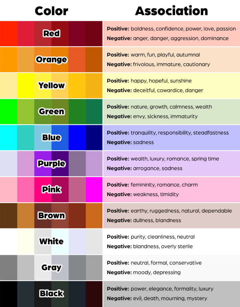
Below is a chart explaining some general associations people have with each color.
Weighing the Factors of Color Association
Who is your audience?
One of the first questions you should ask yourself when you’re marketing is: To whom am I marketing? If your target audience is middle aged men, this will have an impact on the types of colors you choose. It is unlikely that a bright pink logo with flowers will be the way to go. If, however, your target audience is women in their 20s, you might have a better shot with branding like that.
Those are, of course, generalizations. There are always exceptions. But research has shown color preference can vary between men and women, and between different ages. Men typically prefer shades, or darker variations of color, and women typically prefer tints, or lighter variations of color. Children tend to gravitate toward brighter, warmer colors (like red, orange, and yellow) whereas adults prefer subtler, cooler colors (like green, blue, and purple). While these generalizations shouldn’t dictate every color you choose, they can help to better inform your decisions.
Is the color palette appropriate?
Some of the associations in the above chart might not sound so good, but it’s important to remember that context is key. Black probably isn’t an appropriate color choice for a brand of children’s toys. In that context, it could look a little gloomy (there may be a niche market if your target audience is gothic parents). Black can, however, be seen as elegant if you’re using it to brand something like a line of luxury candles or an event planning service. Brighter, more vibrant colors could be fun and playful in the right context, or they could be garish and cheap. Your business’s corner of the market can help you determine your color choice.
Is the color palette differentiated?
Not to completely discredit the last section, but it’s also important to consider differentiation in your brand’s color palette. Differentiating, or standing out, from your competitors is important. If you own a small accounting firm and every other accounting firm has a green logo, you might want to consider a different color. Just, remember your target audience and the perception they may have about the color.
Call Bold River Marketing for help with your color palette.
Like we said at the top, color psychology can be a little complicated. The design team at Bold River Marketing can help you create a color palette for your small business’s brand. We’ll get you set up with a logo and colors that reflect the personality you want your brand to have and help you stand out from the competition. Call us today to get started on branding your small business.